Ahhhh, this is wildly inappropriate for this time of year, but it’s been so long since I even tried drawing anything fun that I had to post this and comment on my thoughts with the benefit of hindsight.
Cruising TikTok I came across a drawing by someone else with tomatoes that had been given character while hanging on the vine. I had to give it a go and this is one of 3 images I came up with.
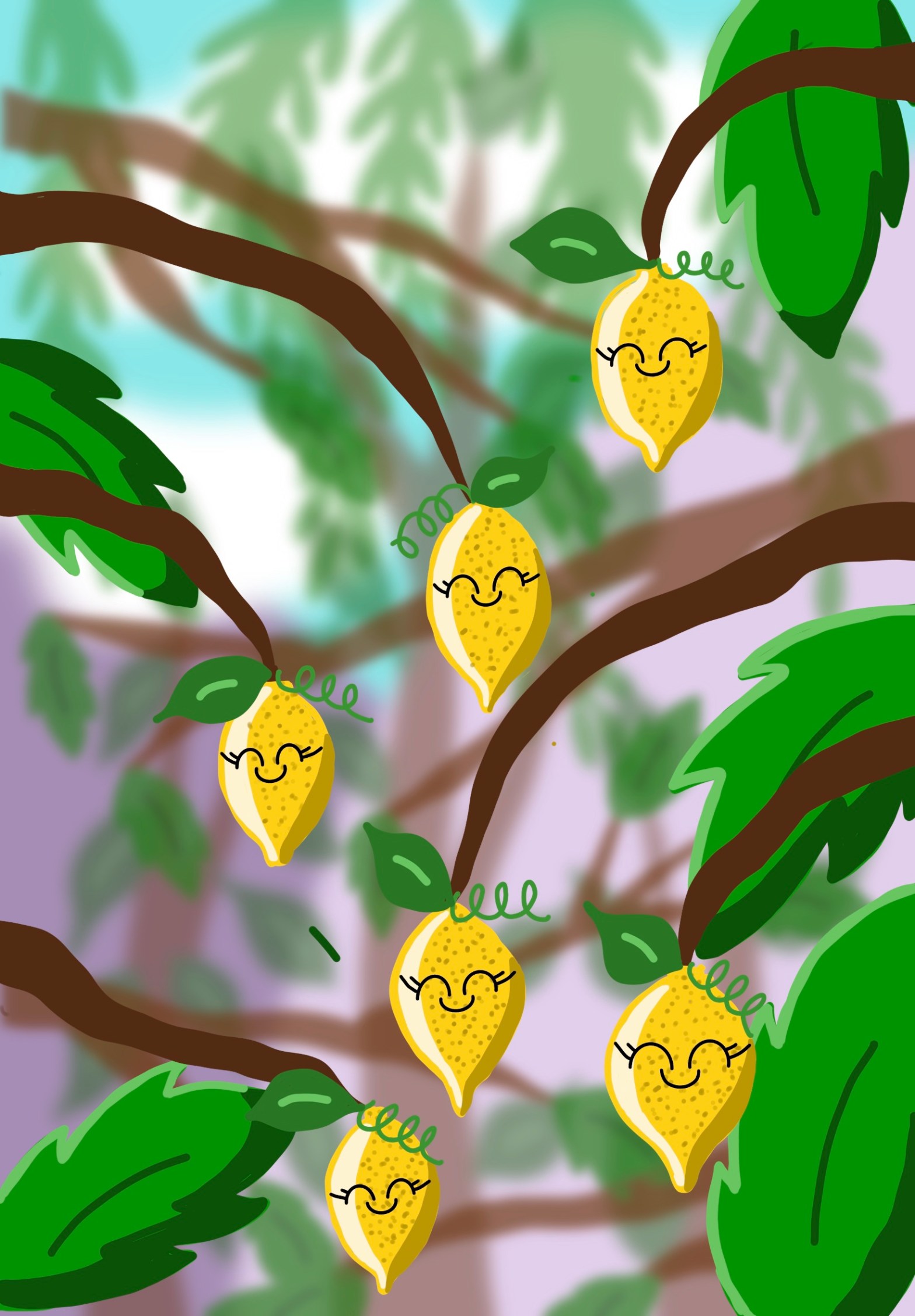
The kawaii style has always been a favourite for me because you can bring to life any object with a tiny, basic but cute face. This is what I was trying to achieve with these lemons, but I’ve failed.
Pros
The colours used are so bright. I often shy away from colours that shock me, such as this intense yellow, but I like the way the lemons bounce out of the picture.
There was a monumental pile of layers in this project and doing this has added so much depth to the picture. It’s a skill I am continuing to try and master. Layers provide an easy way to pile foregrounds on top of backgrounds and I think I’m a bit late to the party in learning about them. They feature more and more as my drawing continues.
I’m not sure why, but I really love the dark and light shades of green in the leaves. Using shading like this helps create a more ‘cartoony’ feel, which always makes me feel happier.
Cons
The character faces are so flat and even after months of practice I don’t know how to make them look more believable. That’s clearly a contradiction, they are fruit, they have zero character. But the artist that created my inspiration for trying this had achieved a charming, friendly quality in the faces on the colourful fruit.
The colours are beautiful but I think they would benefit from being toned down a bit if I try again. Specifically the leaves on the vine are almost a neon green. Maybe if they were darker they would create a richer finish.
I’m going to try this again, likely with a different fruit and with some other additions that might make it more fun. Water droplets (one of my favourite things) and maybe some insects might help with this.
I don’t hate it, but I can ALWAYS see room for improvement in my drawings and this is definitely no exception.

I don’t have your critical eye, as I see vibrancy and contrast in the colors and shading. The pic just makes me feel happy.
I also am a mental health warrior and I write about finding relief. I also 💘 weed brownies love to see one of your expert brownies recipes 😀
LikeLike
Thank you so much for such a kind review. Great to see another Mental Health Survivior making a positive out of a negative. I’ll have a think about my Brownie recipe of choice and maybe post it?! That would be brave – i’m not sure the world is ready for my baking! Steph
LikeLiked by 1 person