October is a busy busy month for writing. Honestly it can be tiring trying to come up with new, quality, interesting and original prose.
So I’ve decided to take a step back for a few days, let the creative mud in my brain settle down a bit and use the opportunity to go back to enjoying drawing again.
I had a look through my archive in Procreate and found a few pictures that haven’t yet made it to the website.
All of them are flawed, but I thought it would be a good opportunity to look at what I created, think about the results and maybe have another go and see if I approach it differently.
I’ve deliberately picked pictures that are totally different in style, time taken and results. I enjoyed drawing them all. Well, I always enjoy drawing, but the processes, colours and brushes I used to create them are, again, totally different.
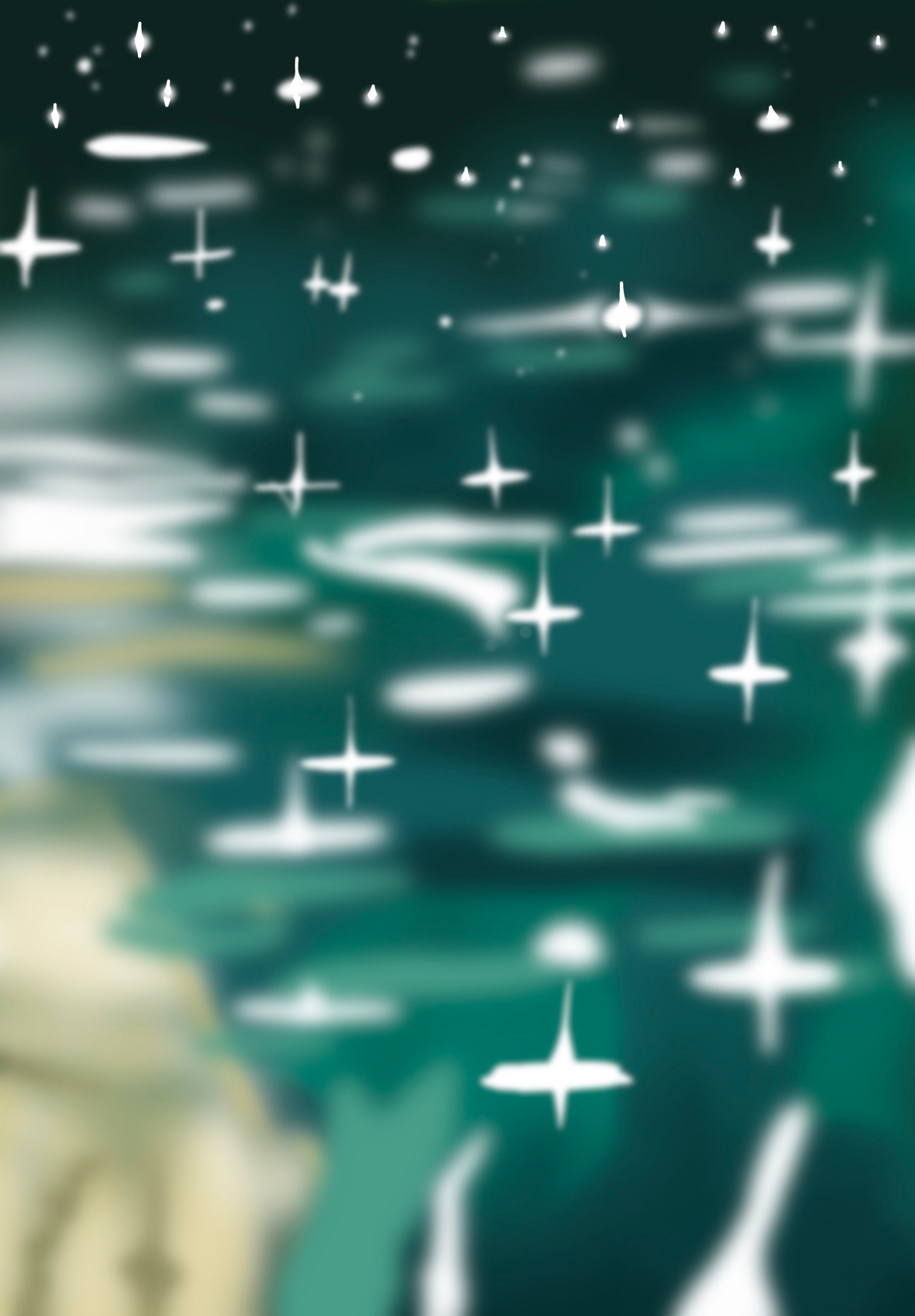
This is the first unpublished picture I was drawn to. It’s supposed to depict the reflection of rainfall on a lake. I found a stock photo to use as a reference and it grew from there.
Pros
I love the colour palette used here. The teal greens and array of blues give it a springtime rain feel.
I also enjoy the lack of detail it shows, although the actual detail needed was pretty high. A lot of close attention was paid to the random nature of the drops and their distribution.
Finally I find myself imagining the stars at night when I look at this image. It’s not what was intended, but I like that there is another positive association attached to it.
Cons
It’s obvious this is my first try at this style. It’s not as polished as many of my other pieces.
I find myself looking for more reflections in the water. It might benefit from some mirrored and blurry scenery amongst the droplets.
While I love the palette used as it is, I do find myself wondering if there’s an opportunity missed by using some other rich colours? Would some oranges and browns give it a more autumnal feel?
I’m going to retry this picture this week in the hope that I can create something more polished, but still different. I might even try to make it look wintery, which will give me artistic license to add some different colours and hopefully give it a different feel.

Exactly why would you continue removing my comments? I have a few really unquie things to say, however my comments never display. Have I done anything erroneous, because if I have then there has to be a mistake. Please reply, thanks!
LikeLike
Your comments are automatically being spammed by WordPress so I’ve only just found this. Sorry for causing confusion but I’ll keep a closer eye on my spam folder in the future. Thanks
LikeLike
Hi, your comments are automatically going into my spam folder, so I’ve only just found this. I’m afraid it’s something that WordPress govern, so I can’t change it my end. I’ll keep a closer eye on my spam folder in the future. Thank you for your post.
LikeLike